Why Your Website Looks Great on Desktop but Terrible on Mobile
You're losing 70% of your potential customers because your site is a pain to use on mobile. Here's how to fix it — without rebuilding from scratch.
By Tunoa Johnson
Grab your phone right now. Go on — I'll wait.
Now, open Google Chrome or Safari, and try to use your own website as if you were a customer who had never seen it before.
Can you tap the "Contact Us" button on the first try, without accidentally hitting the button next to it? Can you read the paragraph about your services without having to pinch and zoom? If you click the hamburger menu icon at the top, does it actually open smoothly?
If you found yourself getting slightly annoyed, you have a mobile problem.
Recently, we looked at the analytics for a local landscaping business. They were getting 1,000 visitors a month, but only two phone calls. Why? Because while their desktop website looked like a masterpiece, their mobile site was a disaster. The phone number was hidden inside an image, meaning visitors couldn't click to call. Since 80% of their traffic was coming from mobile devices, they were essentially turning away 800 potential customers every month.
Over 70% of web traffic in Australia comes from mobile devices. If your site doesn't work flawlessly on a phone, you're not just annoying people—you are actively sending them to your competitors.
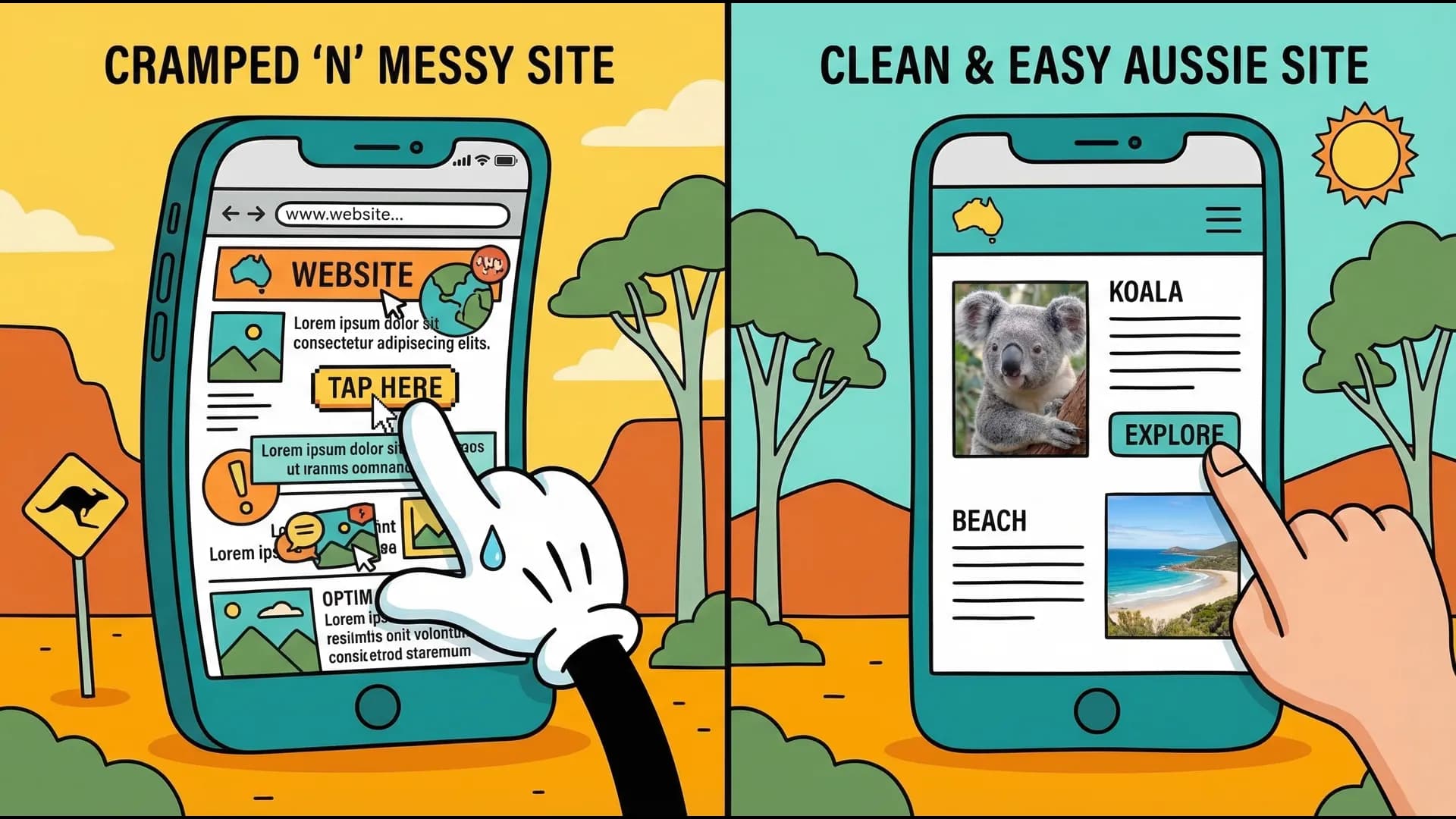
The "Fat Thumb" Problem & Other Common Sins
Here are the biggest mobile usability issues we see every day:
- Buttons too close together: Also known as the "fat thumb" problem. If your user has to employ surgical precision to tap a link without hitting the wrong one, they'll just give up.
- Microscopic Text: Your carefully crafted copy is completely illegible without zooming in. Once a user has to scroll left and right just to read a sentence, they bounce.
- Horizontal Scrolling: The cardinal sin of mobile design. Your website should fit perfectly within the vertical bounds of the screen. If elements are spilling off the side, your layout is broken.
- Forms from Hell: Tiny input fields that your phone's keyboard covers up, dropdowns that don't work natively, or lack of auto-fill support.

The 3-Step Mobile Sanity Check
You don't need to be a developer to test your site. Try to complete these three tasks on your phone:
- Find what you do: Can a user figure out your primary service within 3 seconds of landing on the page?
- Find the price (or how to get a quote): Is the pathway to giving you money obvious?
- Contact you: Can you tap your phone number or email and have it automatically open your phone's dialer or mail app?
If you hit a roadblock on any of these, that's exactly where your customers are dropping off.
Don't just test on your own phone. Test on an older device if you can find one, or ask a friend with a different brand of phone (iPhone vs. Android) to try it. Different screens render things differently.
What Premium Mobile Design Actually Looks Like
When we build or rescue a website, we follow strict mobile-first guidelines:
- Generous Touch Targets: Buttons should be at least 44x44 pixels wide (roughly the size of an adult thumb pad).
- Legible Typography: Body text should be at least 16px. Anything smaller forces the user to squint.
- Sticky Contact Action: We often add a "sticky" bar at the bottom or top of the mobile screen with an icon to call directly. No matter how far down they scroll, the ability to contact you is always one tap away.
- Simplified Navigation: Heavy, complex dropdown menus don't work on mobile. Simplify your navigation to the absolute essentials.
The Good News: You Might Not Need a Rebuild
You don't necessarily need to throw your website in the bin and spend $5,000 on a new one. A lot of the time, the fix is simpler than you think:
- Adjusting padding and margins specifically for mobile screens in your CSS or page builder.
- Making text responsive so it scales up on smaller screens.
- Wrapping your phone number in a standard HTML
tel:link. - Telling your images to scale to 100% of the screen width rather than overflowing it.
Next Steps: You don't have to guess if your site is broken. Go to Google's free Mobile-Friendly Test (or search for PageSpeed Insights) and drop your website URL in. Google will instantly scan your site and give you a checklist of exact errors—like "Text too small to read" or "Clickable elements too close together." Take that list to your developer, or tackle it yourself if you use a visual builder.
Helpful next steps
Keep the momentum going
If this post helped, these are the most useful places to go next.
Tunoa Johnson