The 'Our Building Looks Great' Trap: 5 Mistakes Schools Make With Their Website
Discover the 5 most common website mistakes schools make and how to fix them. From outdated content to generic photos that don't connect with parents.
By Tunoa Johnson
G'day! I spend a lot of time looking at school websites. Like, an embarrassing amount. Way more than my partner thinks is normal, that's for sure.
And here's the thing — I keep seeing the same mistakes over and over again. The kind of stuff that makes parents click away without even realising why something feels a bit... off.
If you're involved in school marketing or admissions, this one's for you. Let's break down what's letting your website down — and how to fix it without losing your mind.
1. Outdated Everything
Nothing screams "we don't really care" quite like last term's sports day photos still sitting proudly on your homepage. Or worse — teachers who left three years ago still smiling away in your staff directory like they've got ghost colleagues.
It's the digital equivalent of still having Christmas decorations up in July. Slightly embarrassing, and definitely not the first impression you want to make.
Set a calendar reminder every 3 months to review your homepage. Takes 15 minutes and keeps things fresh.
Parents are making one of the biggest decisions of their lives. If your website looks like it's been stuck in 2019, what does that say about the rest of the school?
The fix:
- Schedule quarterly content reviews
- Remove anything older than 12 months
- Keep staff directories current — it takes 5 minutes
2. Mobile is an Afterthought
Here's a fun fact: most parents first view your website on their phone. Usually late at night. Usually while scrolling in bed. If your site looks like a jumbled mess on mobile, you're losing families before they've even read a word.
The fix:
- Test your site on your own phone right now
- Make sure buttons are easy to tap
- Text should be readable without pinching
3. Slow as a Wet Week
Parents have got zero patience. If your homepage takes more than 3 seconds to load, they're gone. Poof. Onto the next school.
The average parent forms an opinion about your school in about 50 milliseconds. Your website speed is part of that first impression.
The fix:
- Compress your images (huge files are usually the culprit)
- Ask your web team about page speed
- Ditch the auto-playing videos
4. Navigation is a Maze
Can a parent find your fees? Your enrolment form? Your term dates? If it takes more than three clicks, you're in trouble.
The stuff parents actually need — contact info, fees, how to enrol — should be everywhere. Not buried in some dropdown menu no one knows about.
The fix:
- Put key info in your main navigation
- Have a clear "Enrol Now" button on every page
- Don't make parents play hide and seek
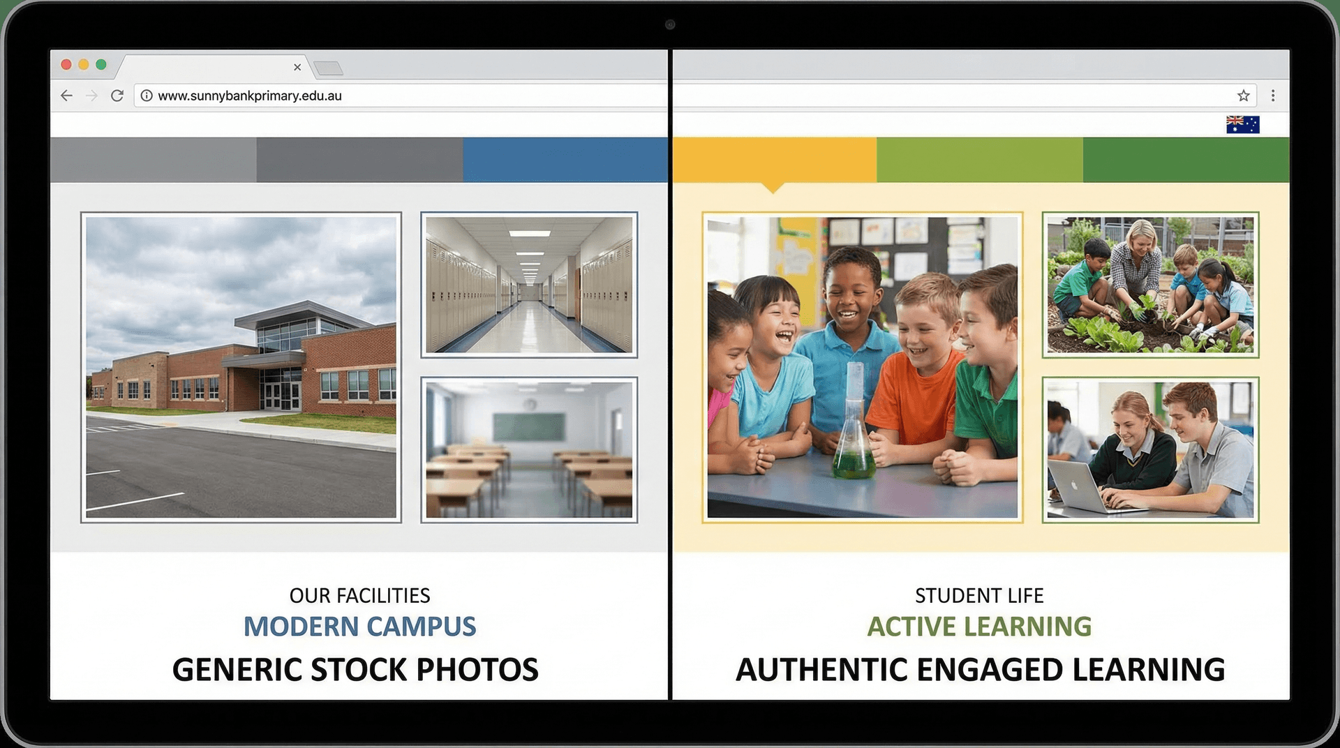
5. The "Our Building Looks Great" Trap
This is the big one. And I see it everywhere.
Schools love showing off their facilities. The shiny new library. The Olympic-sized swimming pool. The architect-designed buildings. And sure — that's all impressive. But here's the thing parents actually care about:
"What's my kid going to be doing?"
Parents don't choose a school because of the building. They choose it because of what happens inside it — for their child.
The Generic Photo Problem
You've seen it. The stock-photo style shots of students in uniforms that don't even match yours. Kids looking at cameras with forced smiles. Generic "learning" photos that could be from any school in the world.
These photos say nothing. They're professionally taken, sure. But they're also completely forgettable.
What Actually Works
Parents want to see:
- Kids being kids — playing, creating, laughing
- Real moments — not posed perfection
- The specifics — your art program, your music, your sports, your hands-on learning
- Diversity — real students who look like the community you serve
Think about it: when you were choosing a school, what made you pause? Was it the building, or was it seeing a photo of a kid doing something that made you think, "I want my kid doing that"?
The Fix
- Ditch the generic stock photos
- Invest in real photography of your actual students
- Show the activities that make your school unique
- Let parents imagine their own child in those moments
Wrapping It Up
Your website is often the first impression you make. It's working 24/7, answering questions for parents at 11pm, on weekends, during school holidays.
Don't let outdated content, slow loading times, or generic photos be the reason a family keeps scrolling.
- 1
Quick Win
Update your homepage with current photos this week
- 2
Easy Win
Check your site on mobile — can you tap everything easily?
- 3
Big Win
Audit your image library — swap generic for authentic
Need a Hand?
If you're thinking "this all makes sense but I don't have time to fix it" — that's where we come in. We work with schools to build websites that actually convert families.
Chat with us about your school website. No hard sell, just a honest conversation about what might help.
Helpful next steps
Keep the momentum going
If this post helped, these are the most useful places to go next.
Tunoa Johnson